Hello, I am 
Here you can read all about my work for Borealis.
Hello, I am
Here you can read all about my work for Borealis.
Help the design squad with the setup of their design system in Figma while integrating closely with the development team to make sure the code and the design follow each other.
UX/UI design
Documentation of the Design System
Write out the requirements for the development teams
Gather requirements from different product teams to improve the design system
Organise and facilitate workshops between design & development to ensure alignment
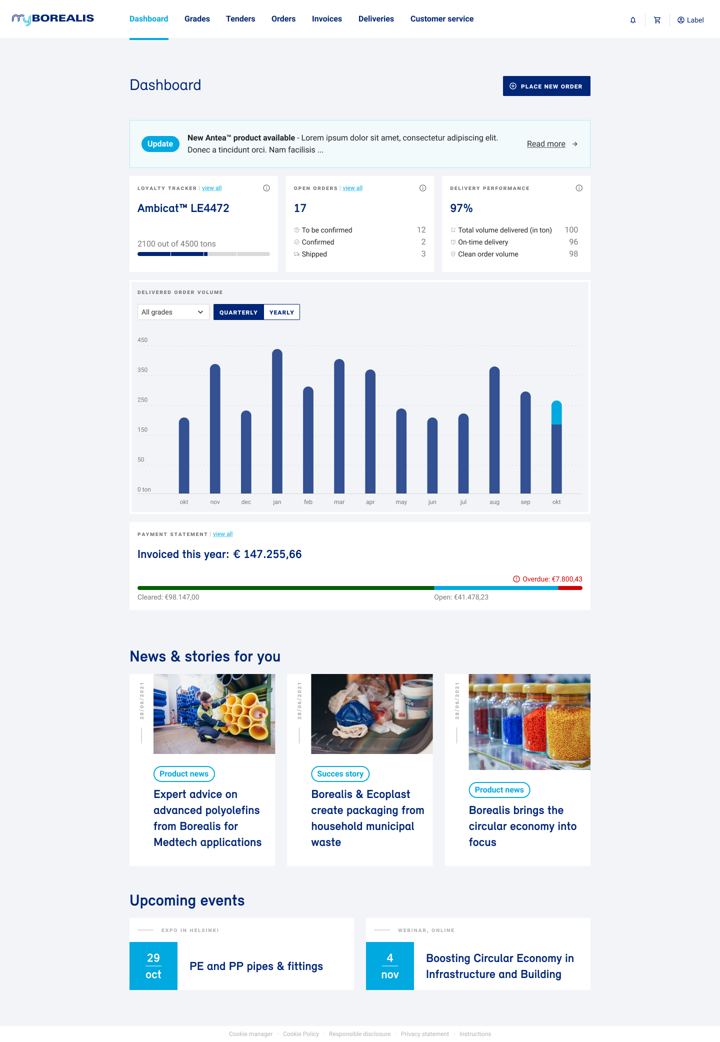
When Borealis reached out to me to help them improve their digital projects I was surprised. I didn't realise how much digital work this chemical company actually produces. They have internal applications to manage complex workflows. They build and maintain an e-commerce platform for customers to order products and follow the delivery. They partner with startups around waste reduction and help them build their apps as well. And they of course have a corporate website.
But, these different touchpoints were built some time ago, and the did not follow the same set of ground rules for user experience and interface. It was time to introduce a design system, and align these projects with eachother.
We decided to adopt the material UI guidelines by Google. But, we realised we needed to improve it, and make the design system our own. The system needs to work for us, not the other way around.
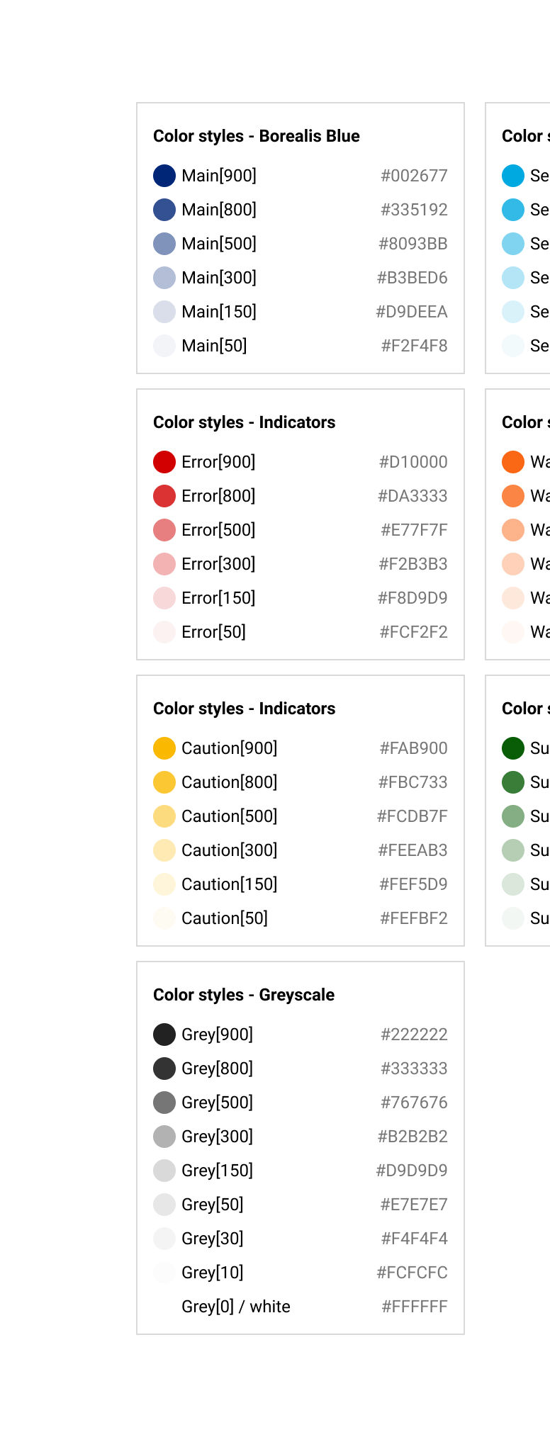
The base of our design system is a clear understanding and alignment by all stakeholders on the design tokens. We spent a great amount of time on this topic, because all further design effort is dependant on these tokens.
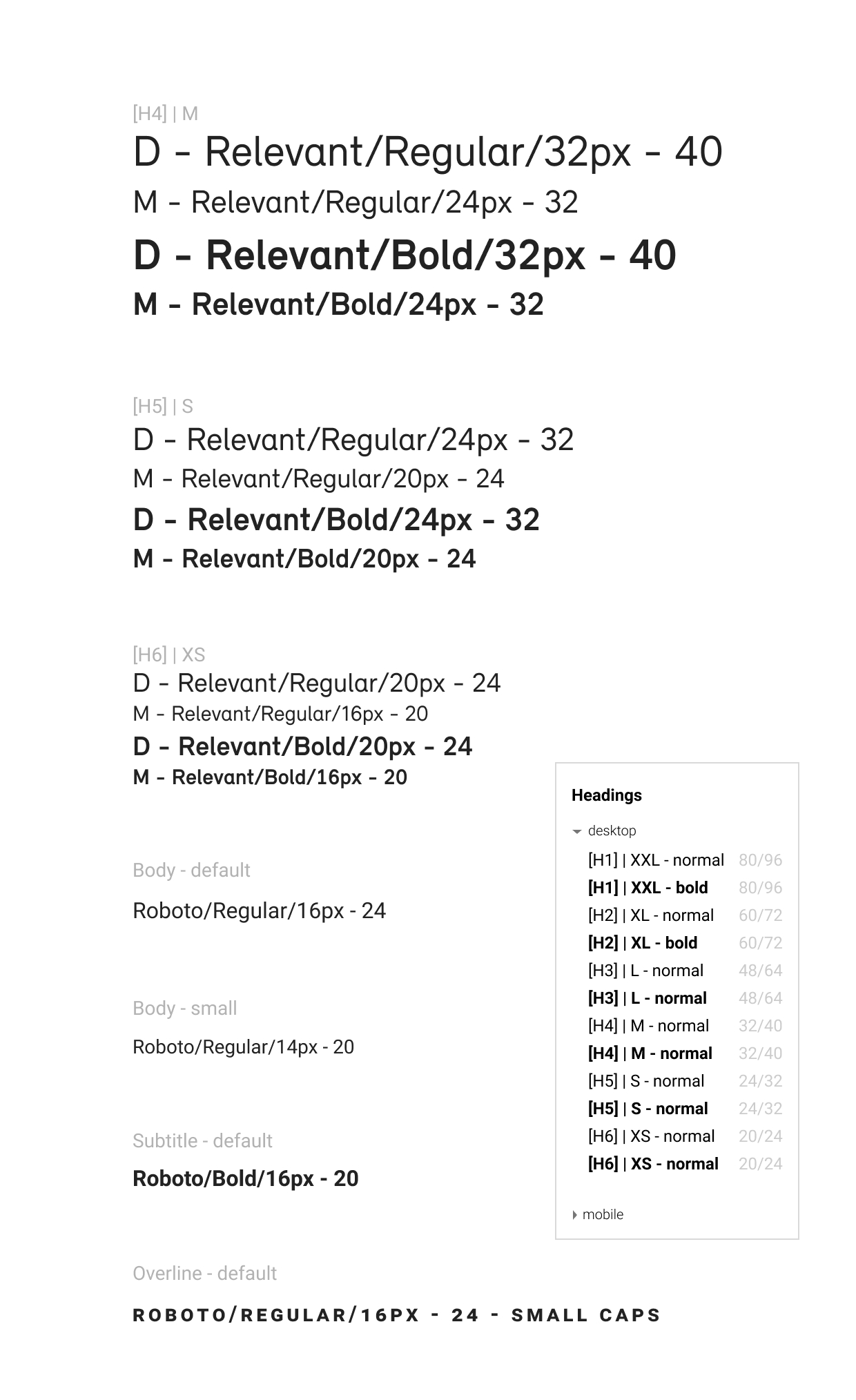
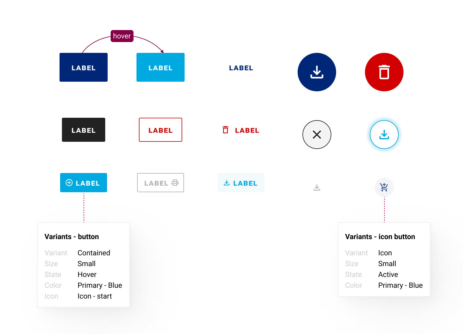
After defining the tokens, we started adopting the default Material components to the Borealis branding with a Material Theme Editor. Every step of the way I validated the designs with the development team to check the feasability and variations we were going to need. Since the development team tried to limit the amount of custom components and extending existing components, it was a search on how to design the things we needed and still be able to deliver it in code.
For example, our new MUI buttons are configured in Figma so that it matches with the MUI setup. On top of that we added auto-layout, overrides and prototyping interactions so that designers can use these buttons in all of their projects quickly and easily.
Together with the development team I setup a Storybook. This allows us to easily test components, see their variations and discuss them further. This also allows stakeholders who are not familiar with Figma to see what exists, and to give their feedback.
The design system is now mature enough to be adopted across al Borealis projects in the future. I'm sure we'll spot things that are missing soon enough. So we keep on working on those components.
I'm going to have more time to help other designers at Borealis to adopt the design system. I'm going to promote the use of variants & interactive components even further to improve the quality of our prototypes.
I'll be available to support teams to adopt the design system in their projects as well.