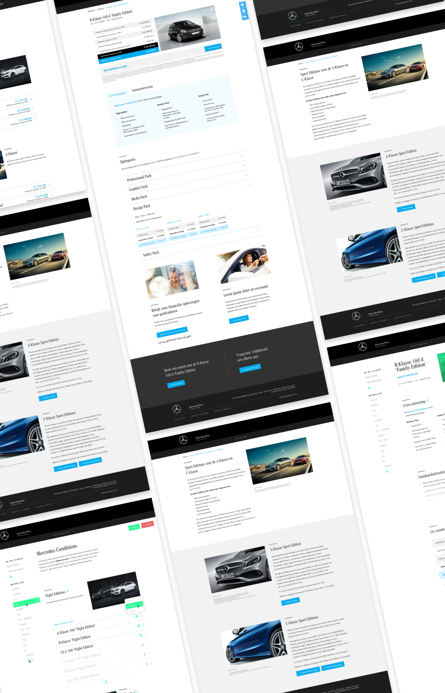
Re-think an existing, slow Content Managment System to optimise product owner workflows and showcase Mercedes as a modern, stylised brand.
Scope definition & budget management
Lead workshops to discover paintpoints
Concept & UX design
Digital project management
Every January, car manufacturers from all over the world put their latest models and promotions on display at the Brussels Motor Show. To support this event, we built the Mercedes Benz Conditions website in 2013, and we’ve been updating it ever since.
Every year we added extra features to the website and the tailor-made content management system to accommodate for new kinds of promotions, additional content and legal requirements.
Because of the growing number of options within the system, marketeers started to feel overwhelmed during the configuration of new promotions. It was a pain to make sure all prices and discounts on the website matched with printed promo materials. They lost precious time uploading content and pictures during an already hectic period. It was high time for a fresh start.
In this article I will explain our approach on cutting content and features from an overly complex system. I’ll show you the steps we took from wireframes to UI design and our technical setup. You will also gain insights into 4 key features our new platform has to offer to make our content managers' life easier.
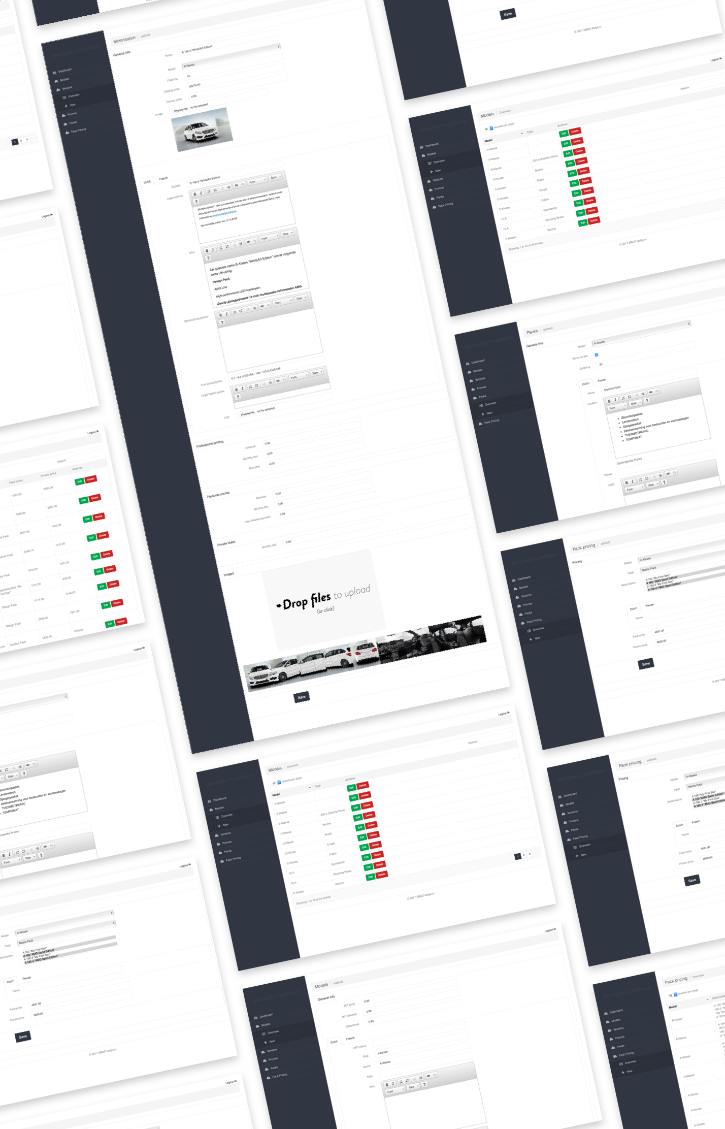
When talking to marketeers, we noticed they had difficulties navigating through the information architecture. It was unclear how different content types were linked to each other. When restructuring the website, we had to make sure the new architecture was recognizable and linked to the real world.
On top of this, the new CMS would need to be responsive to user input. It should be instantly clear to marketeers and other content managers what impact their edits have on the website end-consumers see at home.
Most of the promotions are only finalized by the product marketing team in the weeks and days before the Motor Show. When inputting this new content into the CMS, it should be fast to use.
It’s clear the client needed a clean and easy CMS to stay in control of all their content. But we felt the front-end could use a make-over as well. Merging this new CMS with a modern look & feel for the front-end was in fact one of the biggest challenges of this project.
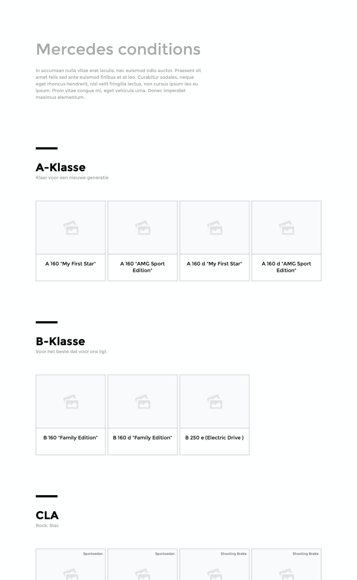
To make sure you can follow along for the rest of the article, here’s a quick overview of how all content on the website relates to each other.
While exploring different navigation options, We quickly decided to minimise navigation and instead use the content itself to find your way through the website. That way, we made sure we’d stay true to our user needs: recognisable, responsive and fast.
After logging in as a content manager, you would see the same website as a regular site visitor, but with a number of extra features that allow you to manipulate content on the spot. No need to open a separate browser window for the CMS. Logged in users can hover over content to see even more options to edit, duplicate or (un)archive that specific item.
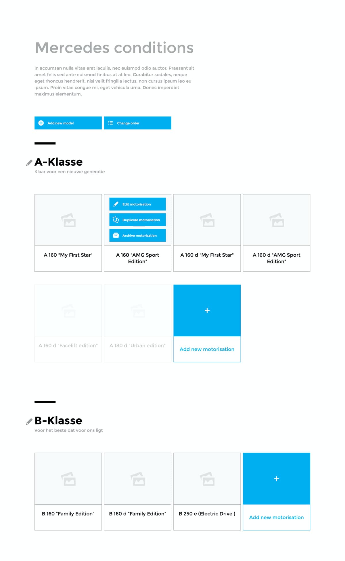
Reshuffling, archiving or deleting content is one thing. Adding new promotions and all required information is another. Lots of information has to be entered before we can output a valid page. To tackle this difficulty, we decided to work with a set of slide-in panels. This helps users to stay in the same mindset they were in when they decided to add new content. They stay on the same page and at the same scroll-height. This way they see where this new content will be added in the website.
The same goes for the detail page of a specific motor version. Each section or chapter of the model gets its own overlayer. These sections hold only the form fields needed to complete that section of the page.
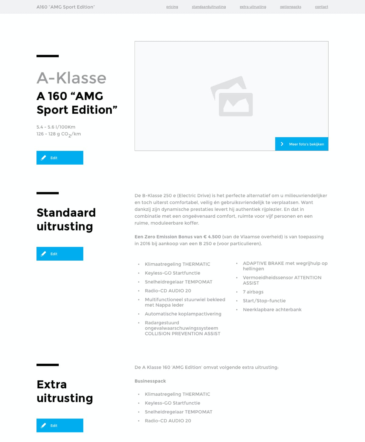
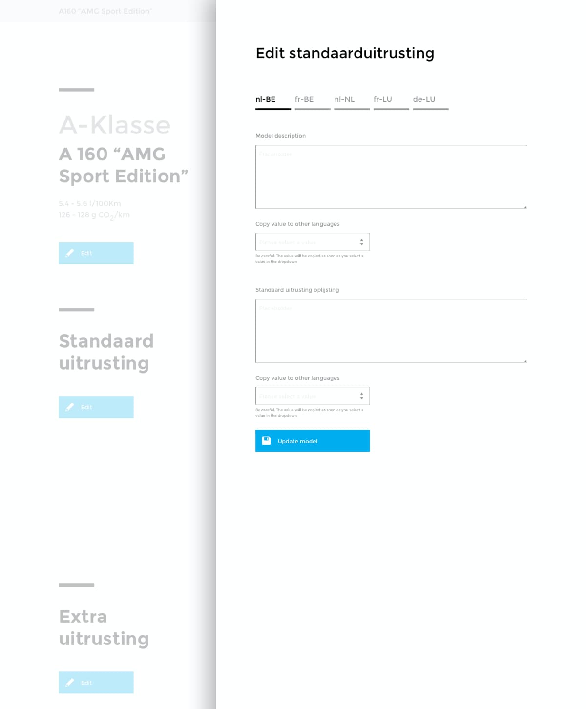
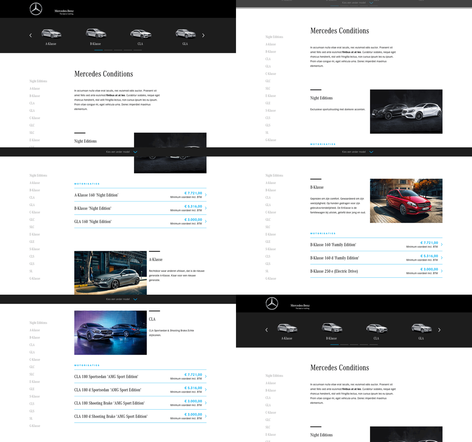
Since this project was aimed towards the enhancement of the content management system, I have to admit that at this point we almost forgot to take the end user into account. That’s why we decided to add navigation sections after all.
We looked at different navigation patterns and decided to add two methods. The first is a fixed sidebar with only the names of the model. Additionally we added a slider on top with visuals. It’s not uncommon that people don’t exactly know which model they prefer, so images help them to narrow down their search.
Once we decided we wanted to add these navigation sections, we started playing around with some interactivity options and different animations for desktop and mobile devices.
Let’s focus back on our content manager. During our research and interviews we came across some interesting insights that led us to design and develop additional features to help them in their efforts to maintain the new website.
The Conditions website exists in five languages. Dutch, French, German and then additional localizations for The Netherlands and Luxembourg. Although they also speak Dutch, German or French there, each country has different legal terms.
To make it easier for a content manager, we added a feature that allows him to copy content from one language to another and only edit the things that are different for the new language.
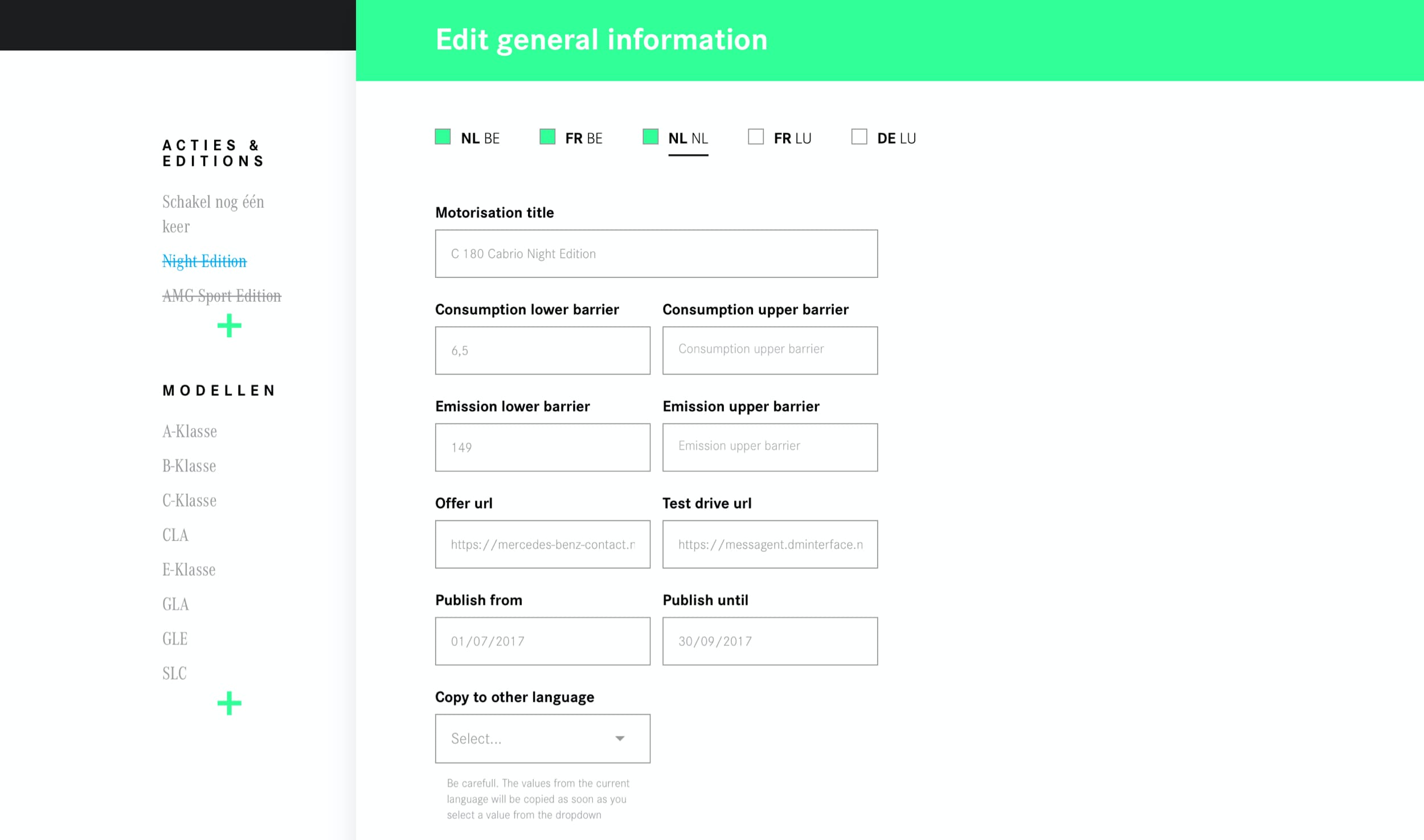
To make sure similar content was formatted in the same way across all promo pages, we implemented two features that made sure that recurring texts were not editable by the content manager.
The section where legal texts like the consumption and emissions have to be filled out has been split into four different input fields (see above). Although this feels like a slower workflow compared to just one field, we made sure content managers could use the TAB-key on their keyboard to quickly navigate from field to field. Having four different fields helped us to format these informative snippets the same way on all different model pages.
In the screenshot below you can see that some form fields are already pre-filled. These fields are disabled, which is indicated by an icon so users know they can’t update these fields. Why even show these non-editable fields? Simple: to help content managers understand how editable and non-editable content is related to each other.
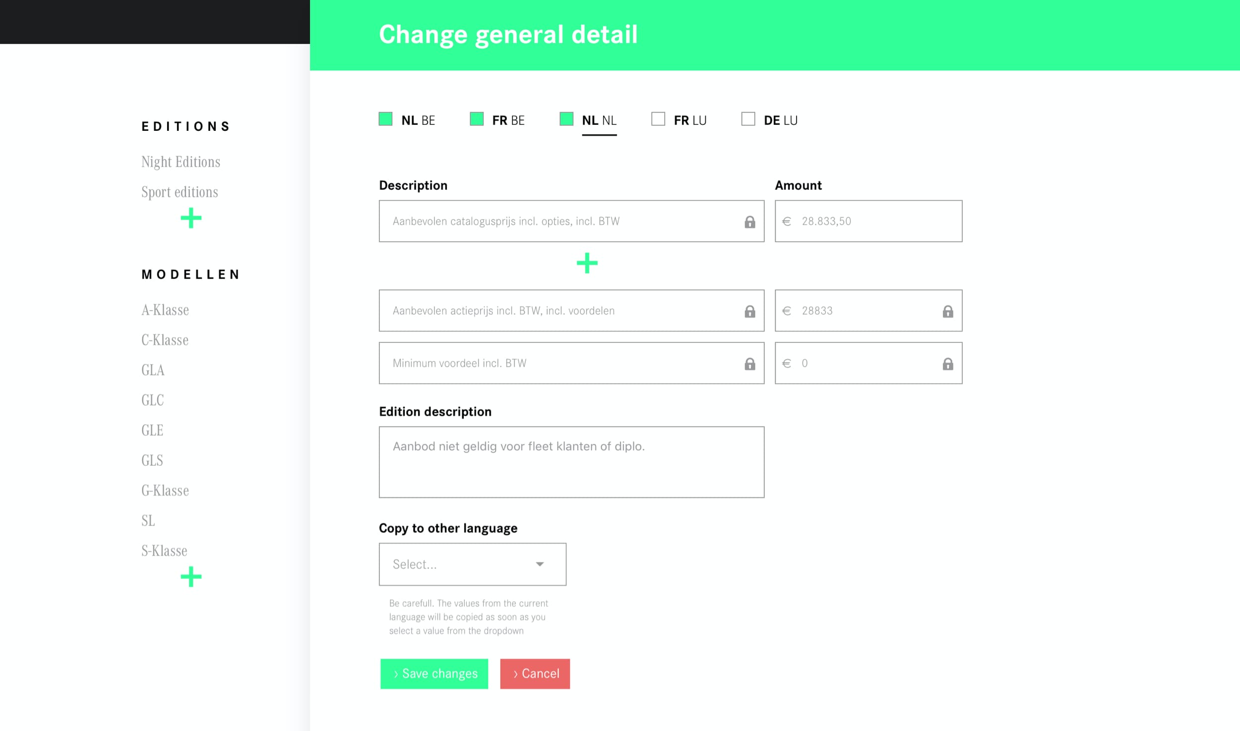
The screen above is the overlay where prices and discounts are entered. Because of our setup in five languages, this screen had to be as flexible as possible: prices and taxes differ from one country to another. On top of that, there is also a service tax that only applies to The Netherlands that needs to be added to the price. It gets complicated quickly...
To prevent wrong pricing information on our website, we kept manual fields to a minimum. When a starting price and one or more discount were entered, the system calculated your total discount and the final price for you.
Anybody working with content can tell you it’s a time consuming task. To lift some of the strain our marketeers experience while maintaining the web content, we’ve implemented features to help them plan their work.
Sometimes the promotion for an A160 and an A180 model might not be that different at all. So, we made it possible to configure one promotion and then duplicate this node. All linked content pieces like pictures, option packs etc. are duplicated as well so marketeers can then edit the newly created model without altering information on the old one.
We also made sure it was possible to configure new pages on the website and schedule when they should be published and unpublished. That way, content managers could better plan their work and feel confident all content would be online at the right time.
One of our goals was to create a responsive, fast platform. To make sure we delivered on this promise, we decided to develop the front-end in React & Redux. Although the design looks simple enough, some elements like the navigation header and the slide-over panels were pretty challenging to develop. We started out by developing individual components and later on grouped them together to make fully functional screens.
All content was stored in a Laravel back-end and passed to the front-end through APIs. Thanks to some talented developers we managed to produce a very fast website.
Another benefit of our React/Redux setup was the fact that multiple people could log in and edit content at the same time without overwriting each other’s updates.
After launching the new website and CMS right before the 2017 Brussels Motor Show, we kept on improving the end-user experience, the content manager experience and the platform performance for two more years:
We reworked both the homepage and a detail page based on learnings we took from metrics and user feedback. We added the option for marketeers to create promotional landing pages with additional info and an overview of models to which that promo applied.
We also made tweaks to our technical setup to increase the performance and stability of the system.
After two years of working on our Conditions platform, the Mercedes-Benz website also got an update. At that time, it made more sense to migrate all promotional content to the main product website and retire our own custom platform.
